


The Stories Behind Ghana's Most Recognized Music Brand Logos
Having a logo is an integral part of making your brand stand out and be a successful one – right up there with having high-quality products and positive referrals.

When we are considering all of the factors that go into building a business, creating a logo might not seem like a top priority.
“I don’t even think I need a logo at all,” a little voice whispers in the back of your mind.
Don’t listen to that voice; because that voice couldn’t be more wrong. Having a logo is an integral part of making your brand stand out and be a successful one – right up there with having high-quality products and positive referrals I must add.
So, why is a logo important? A logo grabs attention, makes a strong first impression, is the foundation of your brand identity, is memorable, separates you from competition, fosters brand loyalty, and is expected by your audience.

Let’s take a look at some successful Ghanaian brands and exports and their logos and what inspired them.
Award winning Director, Creative Consultant and Film maker, Nana Asihene on April 9 revealed he designed Sarkodie and Stonebwoy’s logos.
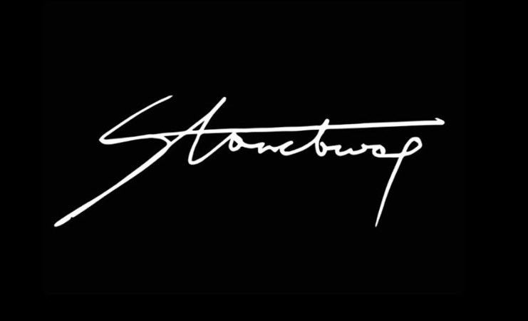
Explaining what inspired Stonbwoy’s logo, the Creative Consultant revealed the font used for the logo was basically his handwriting. The logo we all see now and admire is a metaphor for his rise to the top which includes his ups, downs, curves and more. The single line across represents Stonebwoy’s focus and consistency through continent’s music space.
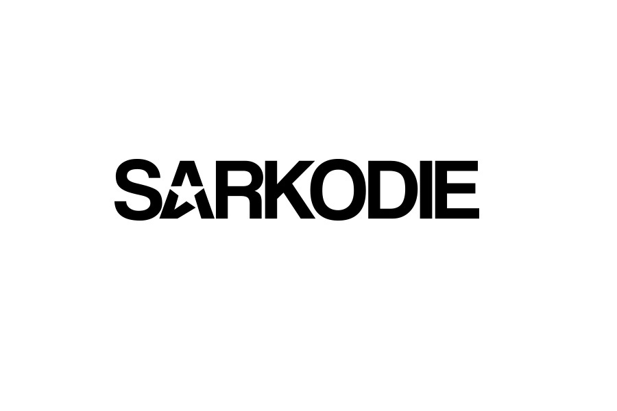
Explaining the Sarkodie's logo and the bold font for the logo Nana revealed that the BET Awards winner is an artist who has made a bold statement and impression on us. Play on the Star. Because he is our star.
Ghanaian Afro-Dancehall artist, Epixode also disclosed that he is the brain behind the official logo of Shatta Wale’s record label, Shatta Movement Family (SMF).
According to the “Avatar” hitmaker, he designed the popular logo years ago without taking a penny from Shatta Wale.
Epixode speaking about the SM logo in an interview made it known the Shatta Movement boss, Shatta Wale made millions in reference to sale of SM merchandises which featured the logo.
I met Epixode in the Eastern Region in 2006 when I went to high school and shared the same room at the boarding house. He was heavily creative and was the go-to guy for all screen printed shirts and more in the school.
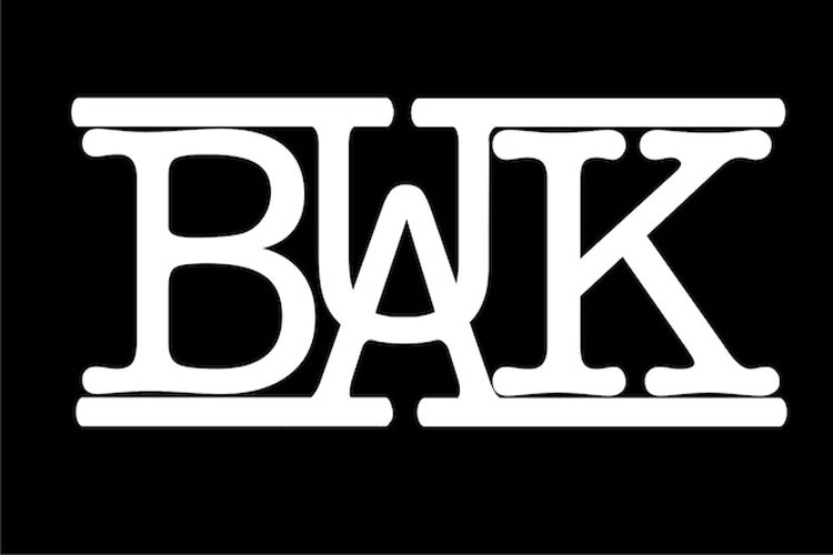
I designed Buk Bak logo.
The Buk Bak logo was designed considering the unity between the two members of the group. The whole idea was to show how solid they were as vocalists and how they complimented each other. That's why the U and A met in the middle.
In 2013, Bright of Buk Bak registered the brand name “Buk Bak” and this logo as the bonafide property of the group.
The musical duo which is made up of Prince Bright and Ronnie Coaches registered this after fifteen (15) year of releasing first album “Komi Ke Kena” in 1998.
In 2014, shortly after the demise of Ronnie Coaches, NKACC directed the video of Mama Don’t Cry No More and the Buk Bak logo featured in the opening frames.